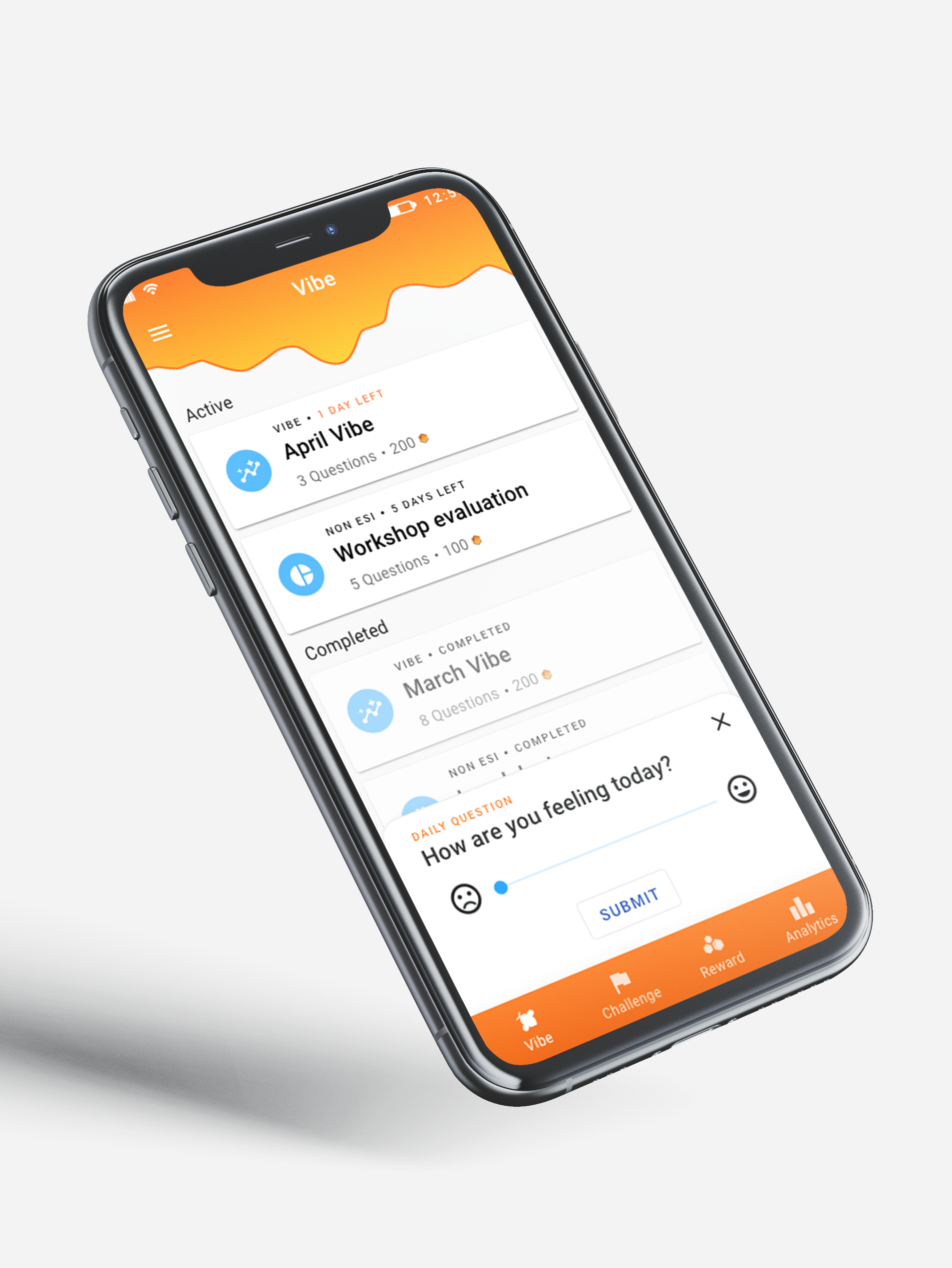
MLP prototype
YEAR: 2021 - Current
TEAM: Inhouse team & off-shore developing company
COMPANY: ESSIQ
After the Master's thesis, ESSIQ wanted to continue the project with the first major goal of launching it internally at ESSIQ. And with a future goal that Vibee becomes its own company where it can be sold as a service to other companies. Since the autumn of 2021, we have developed one mobile app MVP, completed alpha testing, made an updated design, created a brand identity, developed the Admin web page, presented Vibee to the employees. In spring 2023 Vibee was officially launched to App Store and Play Store, and it is currently being used at ESSIQ.
My role in this project
• Master's thesis including rigorous research and concept creating
• I set up and ran workshops with stakeholders to define the user expectations and needs
• User testing the mobile app with consultants and consultant managers in order to verify or remove features
• All UX & UI work of the mobile application, from vision to delivery.
• Design specifications and hand-off to developers
• Communication with the off-shore developing company during the first year of Vibee. This responsibility is now shared mostly between me and the project manager
• Working closely with the team as UX & UI lead to define and evaluate the Admin web page UX & UI design
• Making presentations and promotion videos
• As the team scaled up during autumn 2022, my role evolved into also being the product owner of Vibee. I'm responsible of making sure that the decisions we make aligns with the project vision and goal, such as choices of what to build and what not to build
The process
Design thinking
Design thinking
We have applied the different steps of the design thinking process to this project. As the project have been going on since 2021 I have compressed it into two parts, trying to focus on the most important parts of the product development and mobile interface. If you have any questions, reach out and I'll be happy to explain it further.
• The first part focuses on defining the Minimum viable product scope.
• The second part focuses on the Minimum lovable product and launch internally at ESSIQ.
The question
What can we scale off without loosing the core purpose of Vibee?
What can we scale off without loosing the core purpose of Vibee?
The master's thesis had generated a prototype which held a lot of features that hadn't been thoroughly processed, which needed to be evaluated. We also needed to define the MVP - what the core features were and what could be removed.
💡 Insights
➢ A lot could be scaled off without losing neither feeling nor function.
the UI was visually heavy and stole too much of the users' attention when trying to complete tasks. Several features was also deemed as redundant at this stage, such as history and data filtration.
the UI was visually heavy and stole too much of the users' attention when trying to complete tasks. Several features was also deemed as redundant at this stage, such as history and data filtration.
➢ Several features were revealed as very complex, and would need a lot more work before it was ready for development.
The admin user level could be handled through a simpler web based interface and was therefore scaled off from the mobile interface. The consultant manager level was also scaled off in order to focus on the first level of users. The feature of team based challenges and an early warning system was marked as too complex at this stage and was therefore also removed.
The admin user level could be handled through a simpler web based interface and was therefore scaled off from the mobile interface. The consultant manager level was also scaled off in order to focus on the first level of users. The feature of team based challenges and an early warning system was marked as too complex at this stage and was therefore also removed.
➢ No need for complex information visualization if there isn't any data in the app.
The information visualization from the Master's thesis prototype was rich in details, zoom and filter. But the time and money we are spending on developing this now, is time we could be collecting employee satisfaction responses. The information visualization could be kept minimal, with no zoom and filter - and is instead marked as a high priority once we are live on ESSIQ.
The information visualization from the Master's thesis prototype was rich in details, zoom and filter. But the time and money we are spending on developing this now, is time we could be collecting employee satisfaction responses. The information visualization could be kept minimal, with no zoom and filter - and is instead marked as a high priority once we are live on ESSIQ.
➢ Survey is nice to have, but Vibes are necessary to have.
The survey feature had a lot of different answer formats, but other survey softwares could be used while Vibee MVP is being developed.
The survey feature had a lot of different answer formats, but other survey softwares could be used while Vibee MVP is being developed.
Master's thesis prototype to the left, and the MVP prototype to the right
✍️ Planning
Looking at the future of Vibee required a lot of researching and ideating from our part and ended up as a Vibee lifecycle process, as well as a roadmap. This approach allowed us to understand and decide upon a reasonable timeline for Vibee, what steps it included and what resources the team needed. An Alpha test would be carried out during the summer, and a Beta test in the autumn.
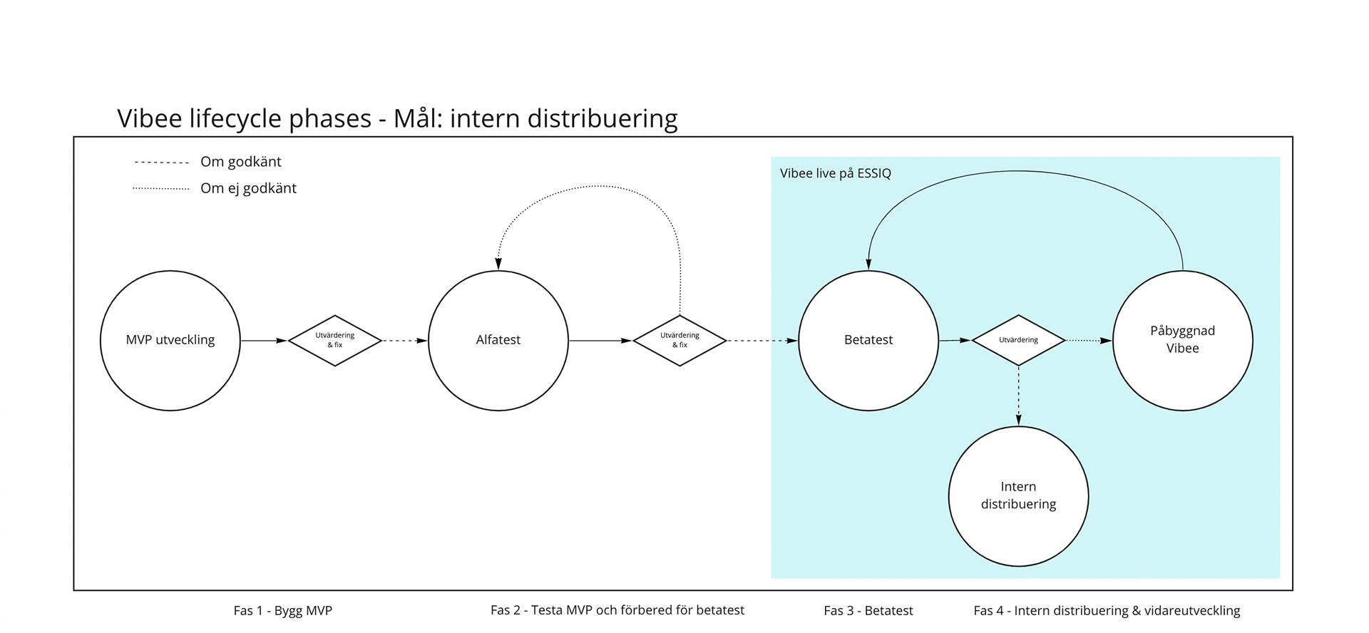
Vibee Lifecycle
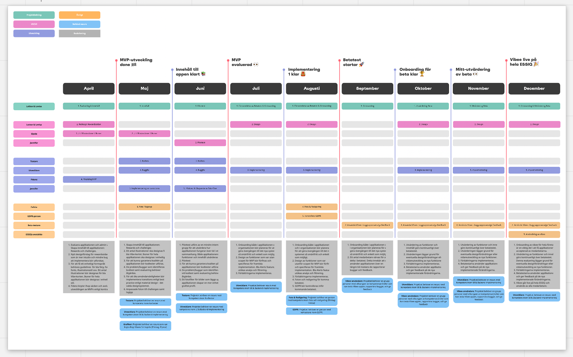
Vibee roadmap
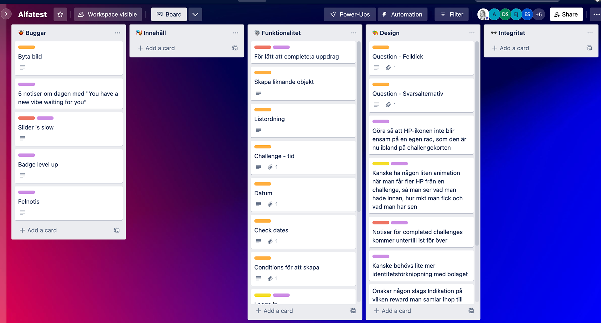
Alpha testing board in Trello
🌟 Result
➢ Scaled down product scope
Vibee MVP was scaled down to one user level, removing features such as survey, team challenges, team rewards, daily questions, and challenge follow up questions.
Vibee MVP was scaled down to one user level, removing features such as survey, team challenges, team rewards, daily questions, and challenge follow up questions.
➢ Vibee MVP
Developments finalized in spring 2022.
Developments finalized in spring 2022.
➢ Alpha testing the app
Test was carried out during summer 2022.
Test was carried out during summer 2022.
MVP prototype
The question
What is our minimum lovable product?
What is our minimum lovable product?
The Alpha test had generated some new insights, highlighting user pain points and needs that had to be cared for before going live. We also needed to tie the visuals together so that the design became more unified, and start the onboarding of Vibee at ESSIQ. In this phase, we were working towards the Minimum lovable product that will be launched at ESSIQ 2023.
💡 Insights
➢ New features required new UX of the mobile Home screen
As we needed to tweak or add new features for the MLP, we also had to change some of the UX to the app. The major changes was made to the pages Home, Rewards and Analytics.
As we needed to tweak or add new features for the MLP, we also had to change some of the UX to the app. The major changes was made to the pages Home, Rewards and Analytics.
➢ Text answer format was needed
There was a need for a regular survey format that could complement the Vibes, and especially the possibility of a text based answer format.
There was a need for a regular survey format that could complement the Vibes, and especially the possibility of a text based answer format.
➢ Uniform design & brand identity
The MVP design used a lot of different visuals, illustrations, and strong colors which grabbed too much of the user's attention and felt a bit all over the place. Colors, typography, illustrations, icons and images were revised and implemented into a new UI.
The MVP design used a lot of different visuals, illustrations, and strong colors which grabbed too much of the user's attention and felt a bit all over the place. Colors, typography, illustrations, icons and images were revised and implemented into a new UI.
➢ Admin web page UX & UI
Content in the mobile app is administrated through the Admin web page. This page was developed for the MVP mobile app based on a list of requirements, and was now in need of both UX and UI.
Content in the mobile app is administrated through the Admin web page. This page was developed for the MVP mobile app based on a list of requirements, and was now in need of both UX and UI.
➢ Onboarding Vibee on ESSIQ
As it is a new work tool, Vibee need to have a well-tought-out onboarding at the company to increase the chances of a positive user response.
As it is a new work tool, Vibee need to have a well-tought-out onboarding at the company to increase the chances of a positive user response.
MVP prototype to the left, and Minimum lovable product prototype to the right
✍️ Planning
In september 2022, the Vibee team grew and got a new project manager who moved our workspace from Trello to Jira. We also started working with Confluence for documentation. This allowed us to collaborate in a smoother manner, and keep focus of what needed to be done.
Our main goal that we have planned for is to go live on ESSIQ. This required me to prioritize features for development with time and necessity in mind, plan for company onboarding, and feedback management during beta testing.
Prototypes
I'm only showing the mobile app solution since I alone have been responsible for it. The prototype is made in Adobe XD. Icons and illustrations have been bought, and the photos used are stock photos.
Minimum Lovable Product - mobile app prototype
🚀 Result
➢ First step of onboarding
The first proper presentation in front of almost the whole company was carried out during the conference trip in september 2022. I was responsible for creating this presentation, as well as the promotion video made in After effects. After the presentation we took the opportunity to collect some feedback.
The first proper presentation in front of almost the whole company was carried out during the conference trip in september 2022. I was responsible for creating this presentation, as well as the promotion video made in After effects. After the presentation we took the opportunity to collect some feedback.
➢ MLP Launch
The developed Minimum lovable product, both mobile app and Admin interface with 2 user roles was completed in March 2023. It was launched to App Store and Play Store in April 2023, available for Essiq-employees.
The developed Minimum lovable product, both mobile app and Admin interface with 2 user roles was completed in March 2023. It was launched to App Store and Play Store in April 2023, available for Essiq-employees.
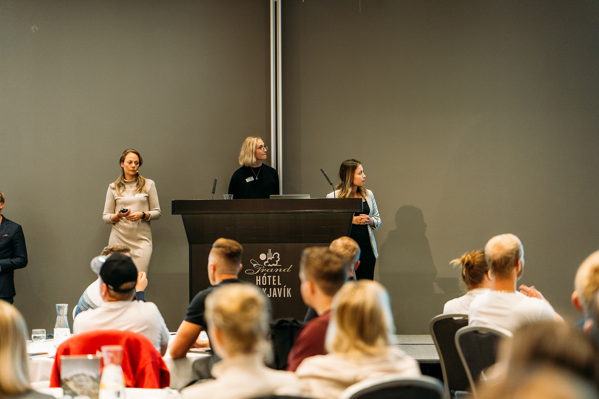
Presentation of Vibee
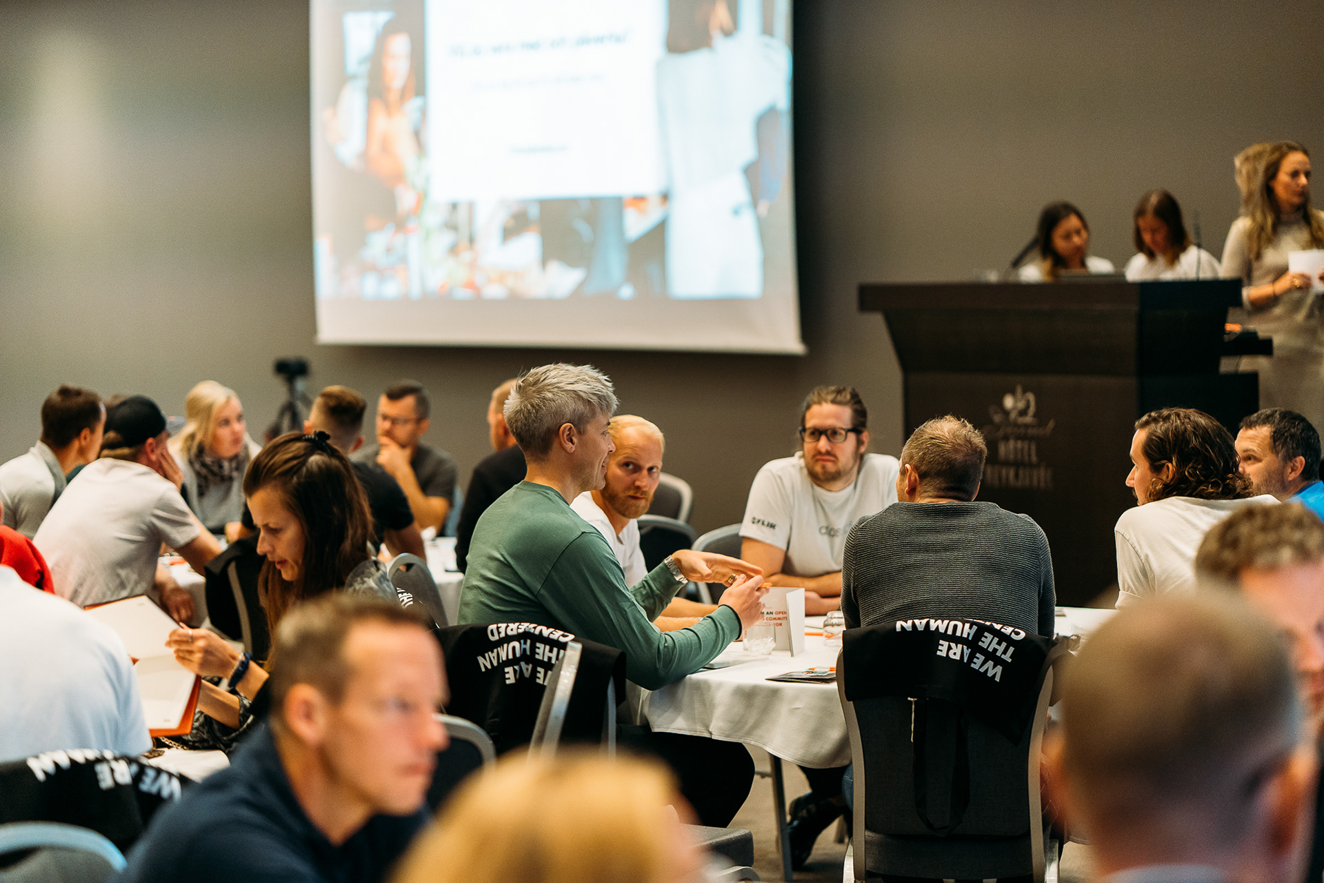
Workshop after presentation
Vibee's first presentation video, made in After effects
🐝 Continuous improvement
➢ User feedback
The app is continuously getting updated and improved based on user feedback
The app is continuously getting updated and improved based on user feedback
