Master's thesis prototype of Vibee
YEAR: 2021 - Current
TEAM: Duo project
DELIVERABLES MASTER'S THESIS: High fidelity prototype and Concept
TOOLS: Paper & Pen, Balsamiq, Miro, Adobe XD, Jira, Trello
👀 ABOUT THIS PROJECT
This project is quite special to me. This is my master's thesis project - which ended up being a full time job at ESSIQ. Me and my dear friend/colleague created this project from nothing into a real product, and it is quite hard to say who has done what since we have worked so closely together for this whole time. I will not go into too much detail since this project has been going on for over a year now, and nobody really has time to read all that. If you want to see our master's thesis in more detail, you can find it here.
So if you have any questions - reach out and I will do my best to explain it all!
PROJECT CONTEXT
➢ Employee engagement softwares
An employee's job satisfaction, or “passion for work”, is one of the strongest driving factors for engagement and dedication. The rise of interest in the subject of employee engagement has come to conclude in an abundance of software solutions and tools for monitoring, understanding and engaging employees, so called Employee Engagement Softwares. But these solutions only cover employees working under the same roof, leaving employees of consultant companies unaddressed. We wanted to find a solution that was tailored for consultants placed at different locations, and find out the actual "user needs" of this group of users.
➢ ESSIQ requirements
The solution should cover surveys in a fun and continuous way, bridging the gap that exists when employees and managers aren't under the same roof.
The process
Design thinking
Design thinking
We followed the Design Thinking process to tackle this ill-defined problem and investigate what's most important for consultants when it comes to feeling connected to their employer and colleagues. Letting user research be our guide, we were able to define core problems, generate ideas, and design multiple solutions. Solutions were tested and the problems were redefined during our process in different iterations in order to find the best possible solution for the users.

Design thinking process steps
Concept & Sketches
ITERATION 1
ITERATION 1
➢ Empathise: Understanding the problem area & learn from ESSIQ employees
• In order to understand the problem area, we conducted three semistructured interviews with the overhead of Essiq. We learned: What softwares they're using, their way of communicating, how they socialize, and how they're working with employee engagement today.
• In order to get a first glimpse of what the employees felt about the current solution, what motivates them and how they prefer to express an opinion, we posted an online survey on the company intranet. We learned: How many questions the employees wants to answer, how they like to express opinions, and what motivates them.
• Interviews with consultants were conducted In order to learn about the difference between working under the same roof and out-of-house. We learned: How communication between consultants and team managers happen, what they were appreciating and what they were missing. The interviews also helped us determine scope of the project and understand the opportunity for an employee engagement software with a focus on consultants.
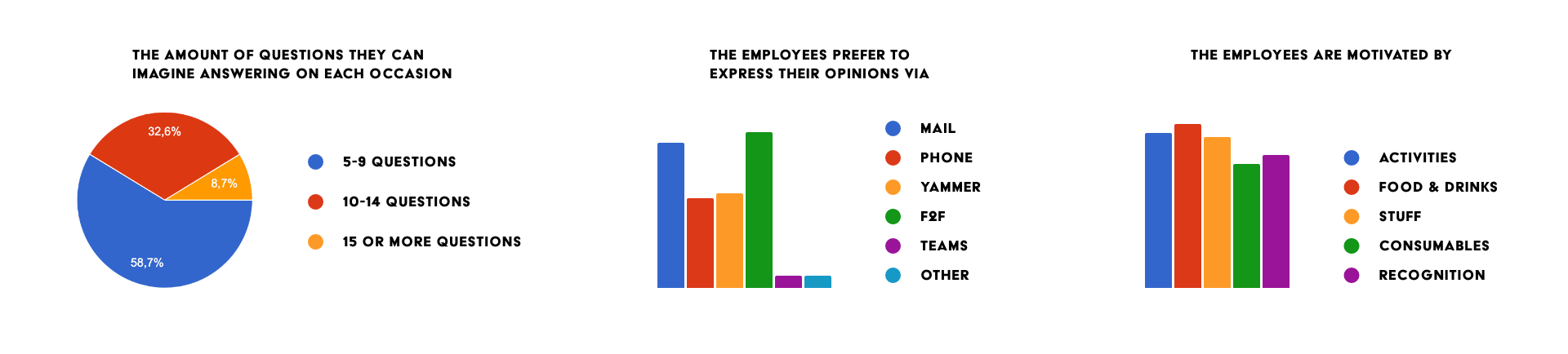
Survey data
➢ Competitor analysis: Similar products already exist
• We started off by analyzing 5 already existing solutions for measuring employee engagement. We learned: Different structures of user types, ways of using surveys, and the risks of showing real time data.
➢ Define: Creating personas
• Five personas were assembled based on interview and survey results. The personas have been revised and updated during the process ensure that the target group and users are portrayed accurately. The personas covers the three user types, four user tiers, as well as specific persona attributes. The name of the personas are fictional, and the image is AI generated from thispersondoesnotexist.com. We learned: Different user paths, user goals and pain points in our sketches and prototypes.
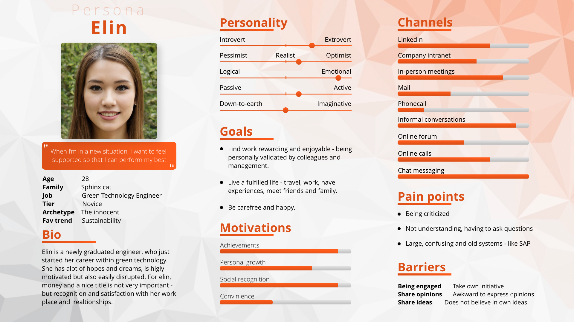
Elin Persona
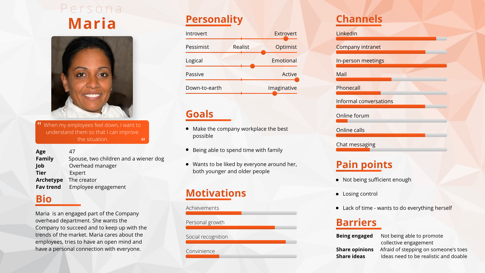
Maria Persona
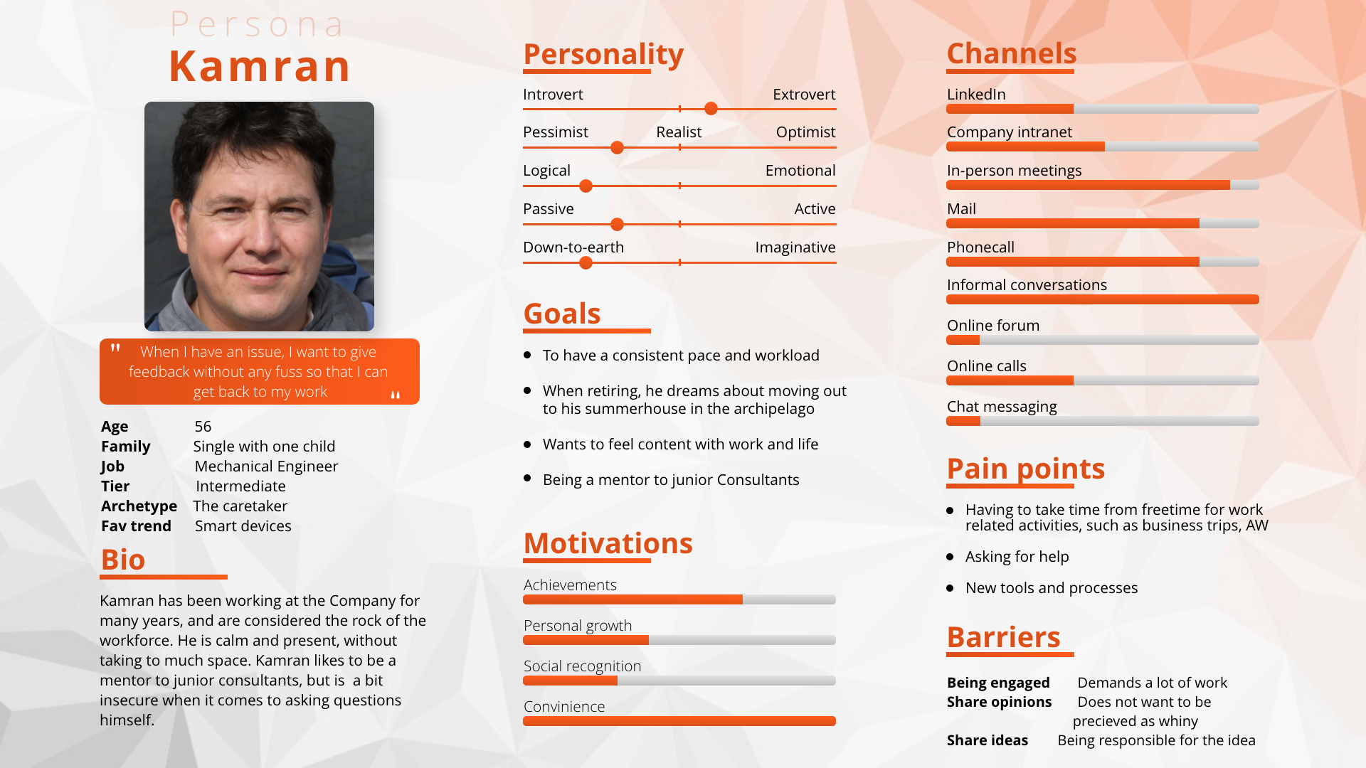
Kamran Persona
➢ Ideate: Starbursting, Reversed brainstorming, Card Sorting, Sitemap
• Starbursting was used as a first method. Why: generated questions rather than answers in order to understand all aspects and options of the problem area.
• Reversed brainstorming of how to make the application difficult and frustrating to use. Why: once the ideas for making the solution frustrating were pinpointed, it was possible to generate ideas that could achieve the opposite effect.
• Card sorting was used to arrange various features of the solution. Why: laid the foundation for creating a sitemap.
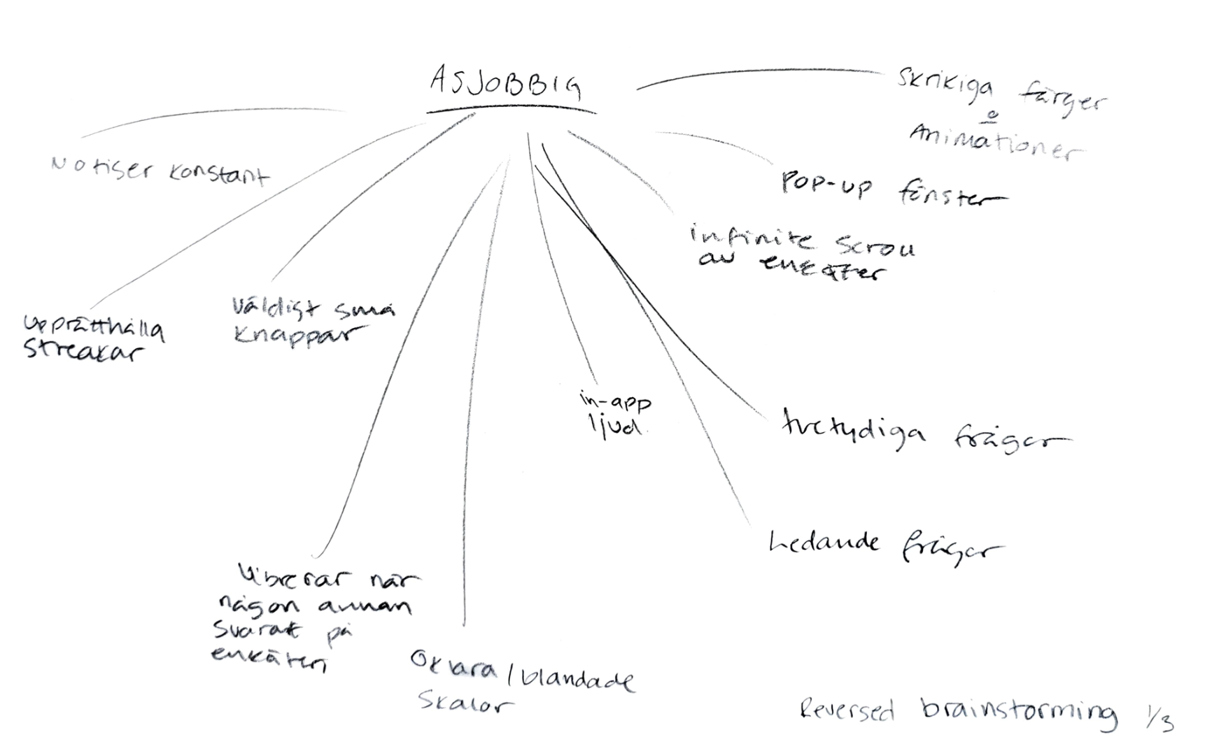
Reversed brainstorming part 1
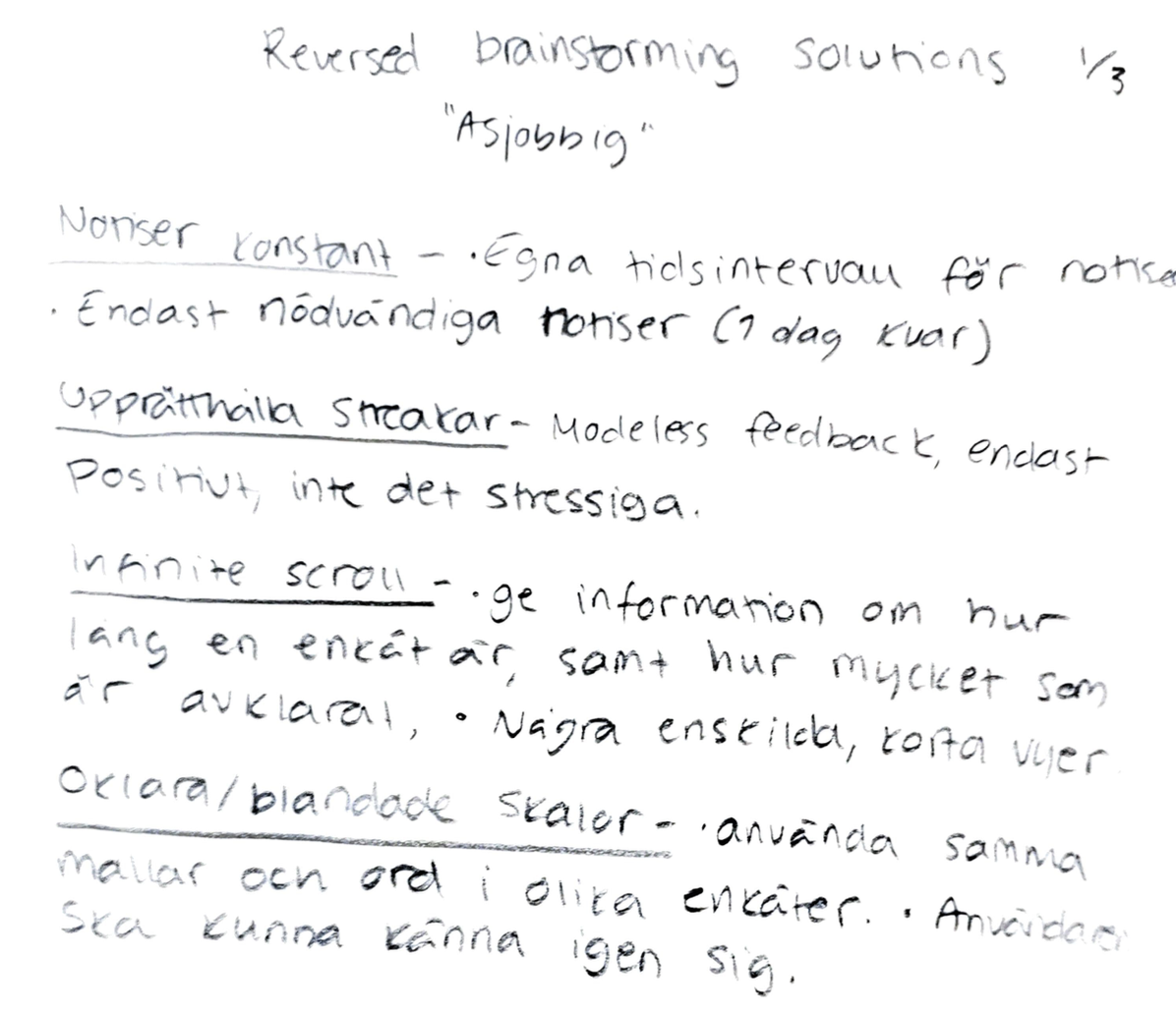
Reversed brainstorming part 2
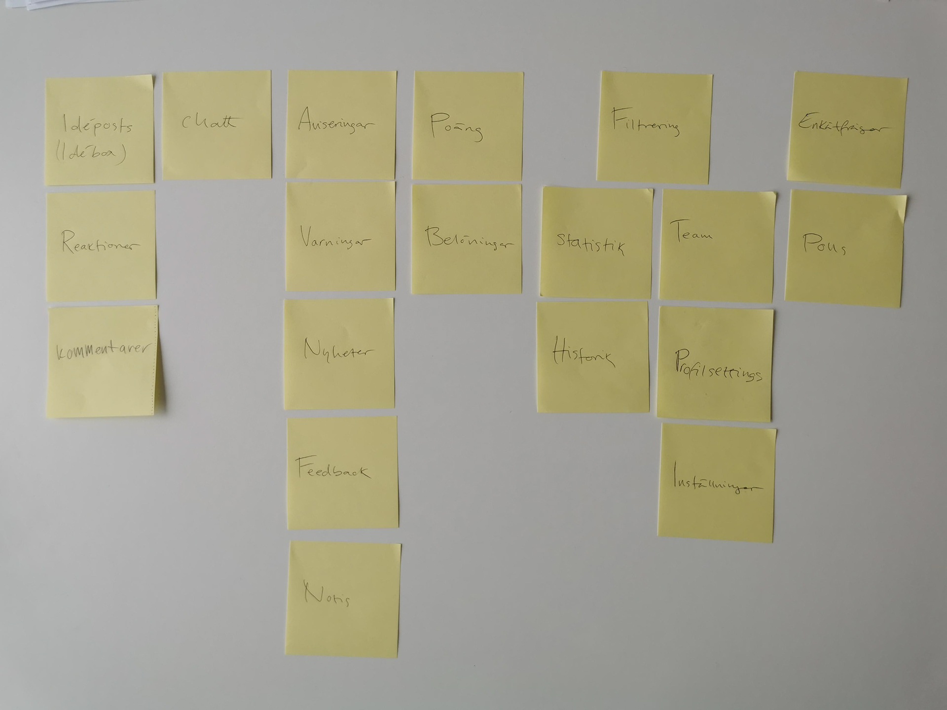
Card sorting
➢ Prototyping: Sitemap, Paper & Pen, MDA-model
• Sitemap - which has been revised during the process. Why: acted as a guide for sketching, wireframing and prototyping, as well as understanding hierarchies and flows.
• Rapid paper prototypes were made with a focus on four categories: home/surveys, engagement, statistics, and quantified self, as well as their respective functions and features. Also, different possibilities of responding to a survey or a question were visualized. Why: visualize and process ideas.
• An MDA-model was created. Why: showcase relationships within the gamification system.
➢ Evaluate: Concept and sketches
• Both concept and sketches were evaluated in two groups. One group of ESSIQ management, and one younger group representing new employees on the market. We learned: direction of project.
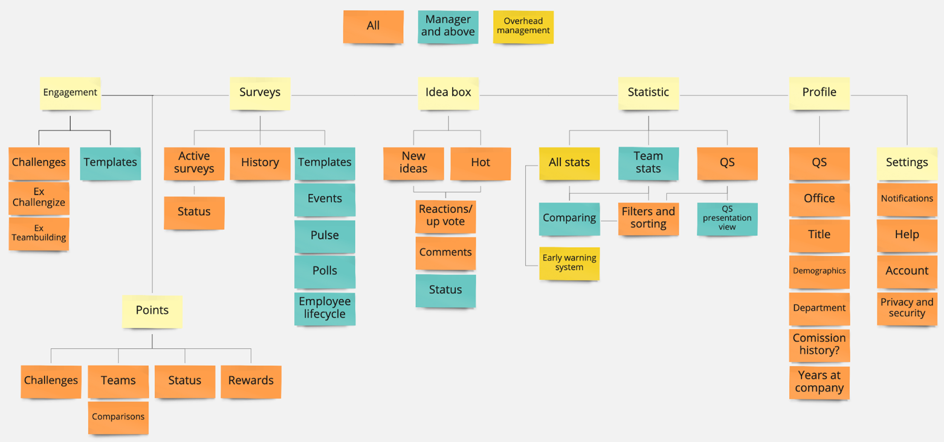
Sitemap 1
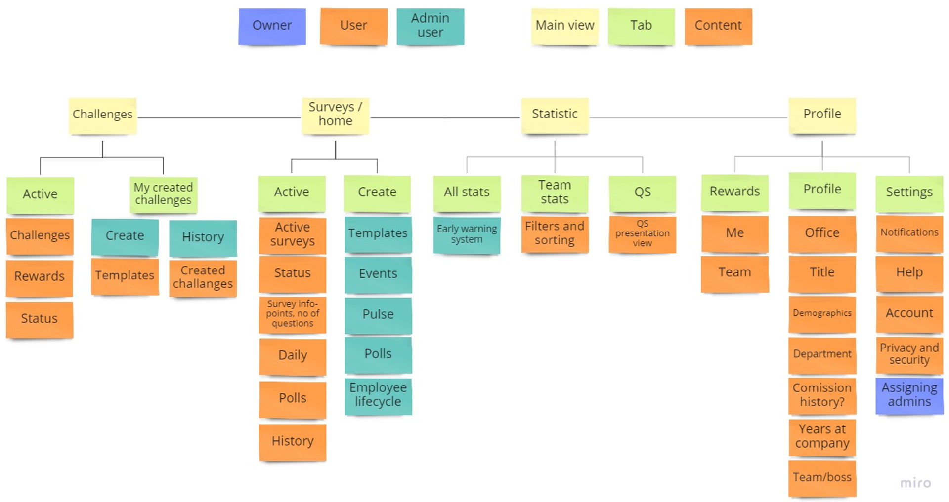
Sitemap 2
Sitemap 3
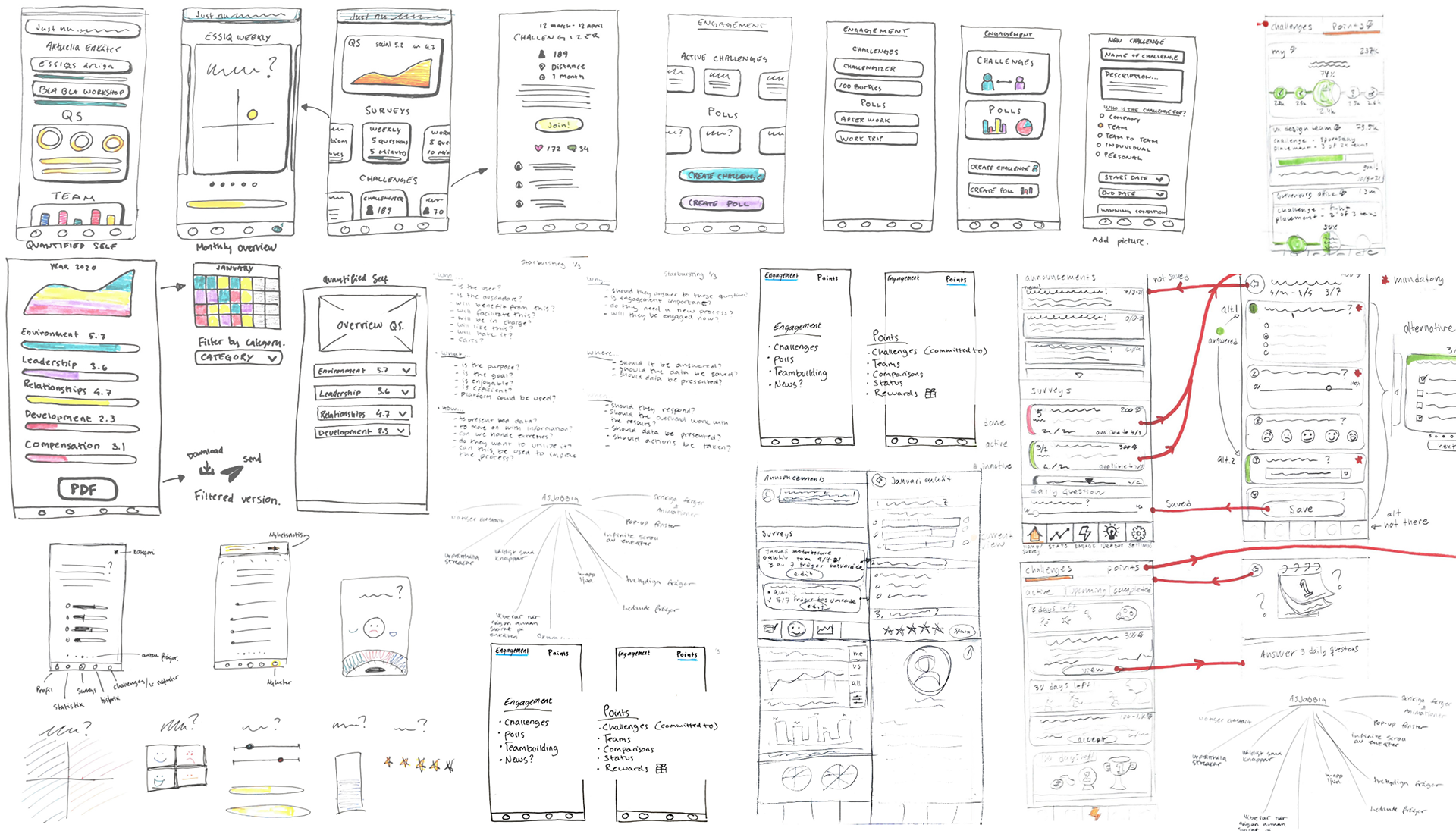
Paper sketches
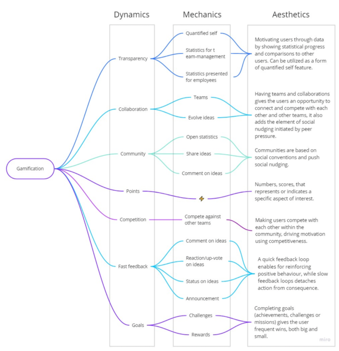
MDA model
Wireframes
ITERATION 2
ITERATION 2
➢ Empathise: Understanding of context
• Expert interviews with HR. Why: provided insight to EES practices and a HR perspectives.
• Semi structured interviews with a part owner of an established EES provider. We learned: the need to push and evaluate our EES products' competitive advantage of being targeted towards remote employees.
• Semi structured interviews with the management. Why: complement the specific part of the problem area regarding remote consultants.
• Structured interviews with consultants. We learned: feelings of communication, community, and attitudes towards EES.
➢ Define: Sitemap, Personas, & Focal points
• Both sitemap and personas were revised based on previous evaluation. Why: to be as accurate to the current work and users as possible.
• Analyzing interviews and conversations. We learned: three focal points; 1) the importance of company transparency 2) having contact with company on a regular basis in order to ensure personal connection 3) expectations for communication should be shared between employees and management.
➢ Ideate: Onboarding
• Researched different mobile applications in order to observe both what to do, and what not to do when implementing a new tool in an employee's work processes. We learned: combination of welcome screens, checklists, meta onboarding and empty states would suit our product.
• Based on the evaluation of the sketches, some new sketches were made and then developed into wireframes using Balsamiq. Why: with about 55 wireframes in total, the wireframes show a basic design of content, element placement, features and states of the four main views - home(surveys), challenges, statistics and profile.
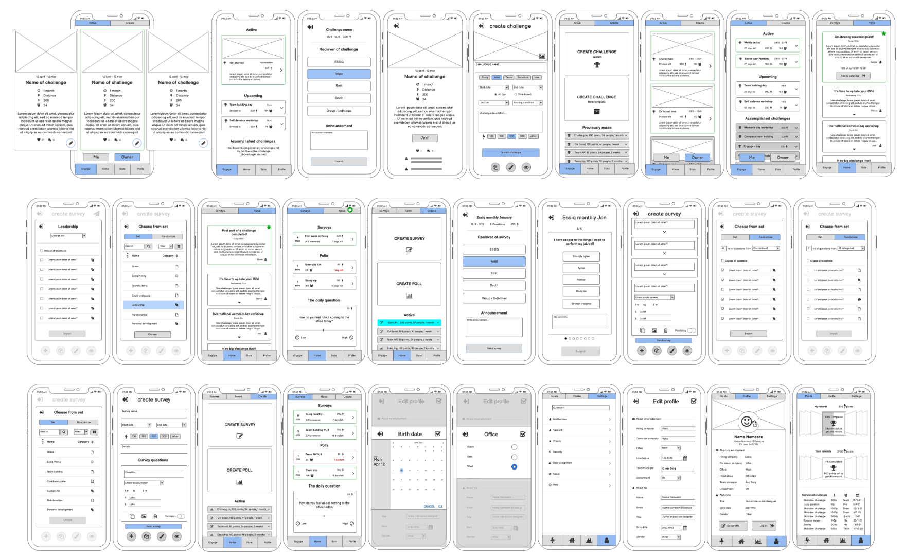
Wireframes made in Balsamiq
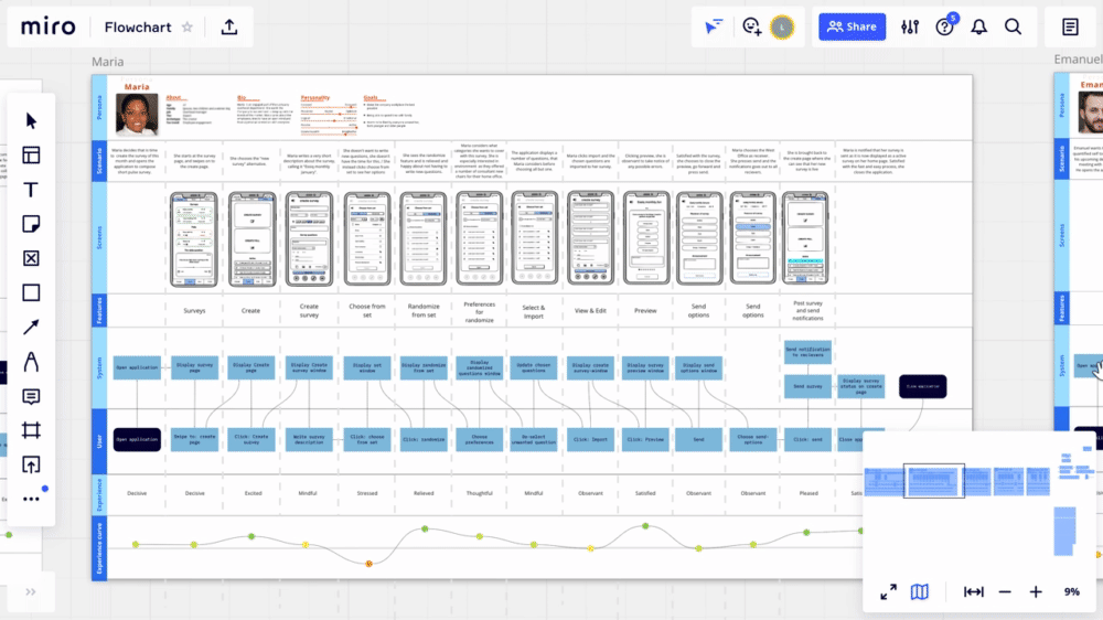
➢ Prototype: Scenario description swimlanes
• The swimlanes includes personas, a scenario, wireframes, features, system and user workflow, as well as user experience and experience curve. Why: visualize the user flow for specific scenarios. We learned: weak and strong parts of the design, and where there is a need to develop more views.
➢ Test: Expert evaluation
• The wireframes were evaluated through an expert evaluation. Why: providing insight and
feedback from a senior UX-designer. Aspects such as Android standards, hierarchies, element placement and size were discussed.
feedback from a senior UX-designer. Aspects such as Android standards, hierarchies, element placement and size were discussed.
• Methods, wireframes and flowcharts were evaluated as a presentation with overhead managers. Why: ensuring we meet stakeholder requirements.
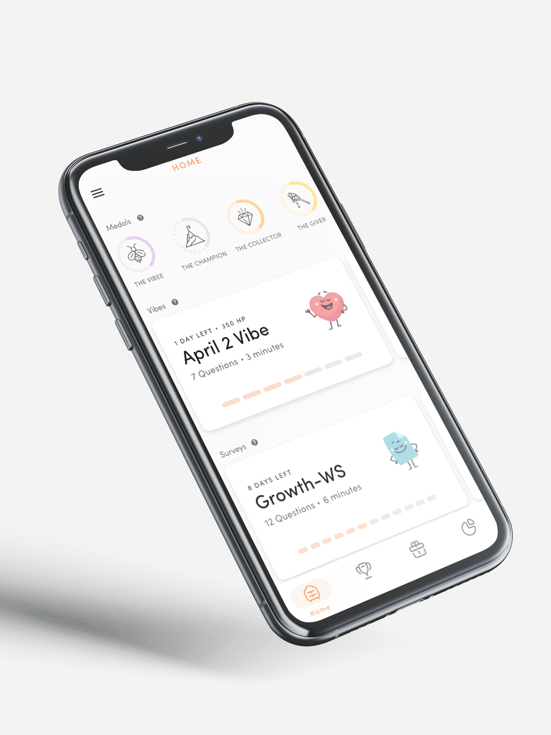
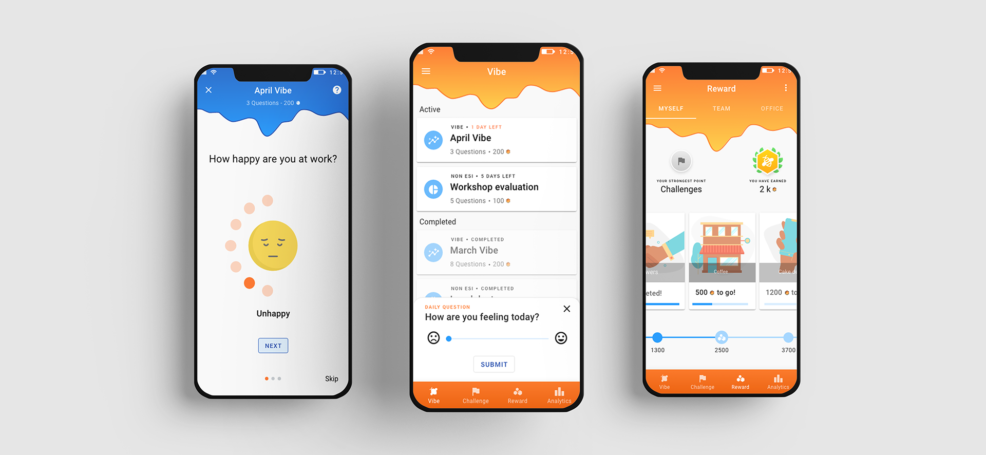
High fidelity prototype
ITERATION 3
ITERATION 3
In this iteration, the design thinking phases proceeded in a more parallel manner than previous iterations, where ideation was explored through prototyping, and empathizing with the users through evaluation. During this process, several versions of prototypes were explored and developed using Adobe XD.
➢ Empathise
• Understandings from the expert evaluation was processed. We learned: a design framework could help to define and understand the problems in the current user interface, as well
as how to possibly solve them.
as how to possibly solve them.
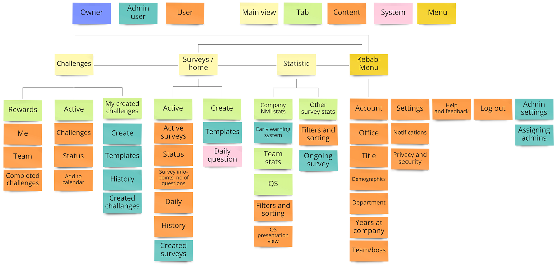
➢ Define: Sitemap, Material design
• The sitemap was once more revised. Why: providing a detailed hierarchy of the system, and what features are accessible for what kind of user.
• Using Material Design. Why: provide guidance in comprehending aspects such as hierarchies, mental models, element positioning and differentiation, color usage and more.
➢ Ideate: Name, Graphic profile & Interactions
• Brainstorming names of the concept based on different words such as pulse, engage, beehive, vibe, and survey. Why: the user’s experience of the application is not only based on layout and functions, but also on the look and feel of the interface, and its name.
• The ideation continued with working on the graphic profile in parallel to prototyping.
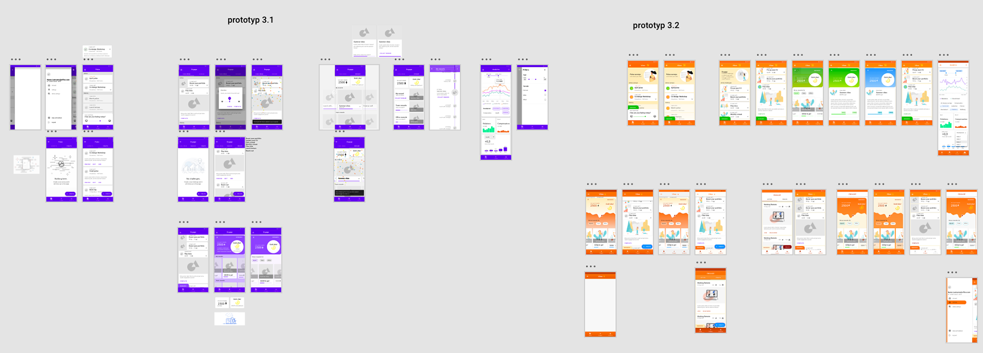
➢ Prototype: Mid-fidelity prototype
• Using material design, the main views of the wireframes were developed into a higher fidelity level using Adobe XD. When the main views were made using material design (in purple), we started working on the look and feel of Vibee (in orange).
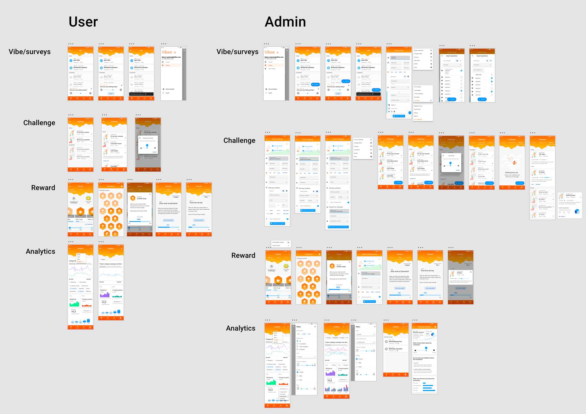
➢ Prototype: High fidelity prototype
When the graphic profile and views had been decided, we proceeded to develop the high fidelity interactive prototype for both user types in Adobe XD. The dashboard for the analytics view was composed based on earlier sketches and created in line with a narrative, reader-driven approach, as well as in regards to Shneiderman’s mantra of “Overview first, zoom and filter, then details-on-demand”.
➢ Test: Summative evaluation
In accordance with the smaller iterations in the prototype phase, several iterative usability tests and evaluations were conducted for the high fidelity prototype. We learned: limitations of testing due to not all elements in prototype being interactive, team based challenges can cause frustration, and the desire for a text based answer format. But overall - they liked it!
OH BOY, OH BOY,
that was the end of the master's thesis.
that was the end of the master's thesis.
It was time for a summer break from Vibee. When the autumn arrived, we were able to look at what we had done with a fresh pair of critical eyes. And with some perspective to it all - we could see that the master's thesis had been a big divergence phase, and it was now time for convergence.